The motorcycle. Redefined
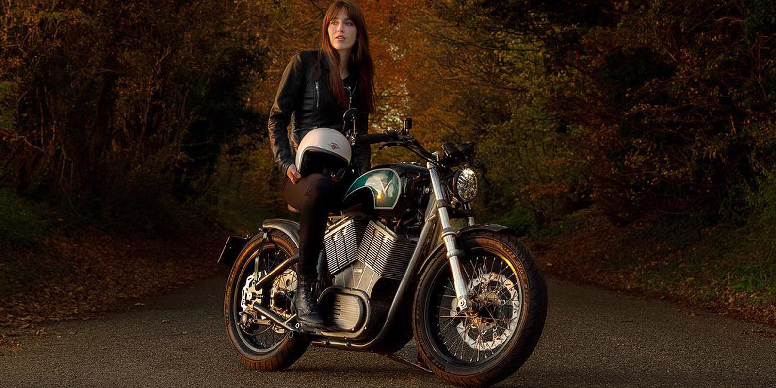
This is a story of how we helped one man’s passion to create and market a vintage electric motorbike brand.
Having previously worked with Steve to create the identity of a prototype electric motorbike – the eV Twin – he approached Blue House Design to create the identity and marketing collateral for the brand.
Steve was looking to raise interest in the brand and had already booked exhibition spaces at the Monaco Yacht Show and Motorcycle Live – the largest motorcycle exhibition in the UK.
- Client
- Veitis
- Services
- Brand and graphic design
- Web design and development
- Video and photography
- Website
- Veitis
Results and impact
Funding for mass production
Since the Motorcycle Live show, Veitis has secured funding to begin mass production working in partnership with UK universities.
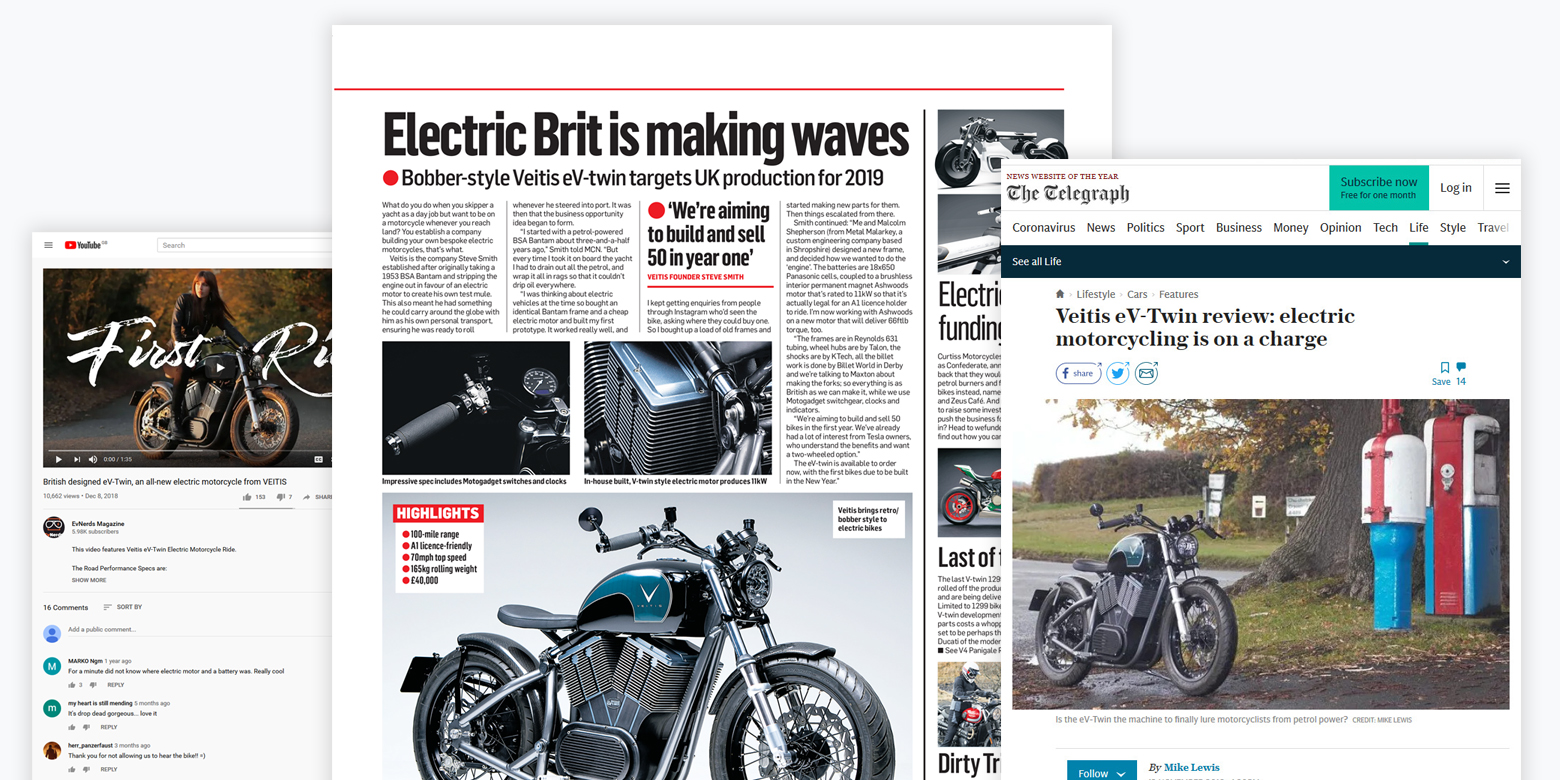
Featured in magazines and newspapers
The brand has gained significant traction being featured in the Telegraph, Motorcycle Sport and Leisure and Motorcycle News – the world’s biggest weekly motorcycle newspaper.
The full story
Brand identity
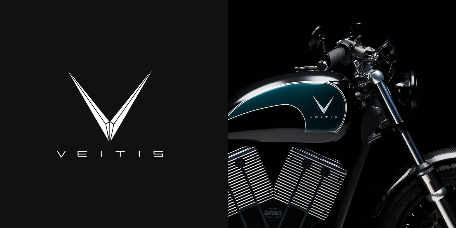
To create the identity we ran several workshops with Steve to define the values of the brand and the target market. During the workshops we discovered that the bike itself is often what defines the brand. We also found through our research that most competitors developing electric motorbikes aimed to be futuristic.
As the motorbike frame was based on early 20th century designs, we came up with the concept of luxury modern vintage. The finished logo reflected this in a simple and versatile logo and word mark.
Marketing collateral
The next phase of the project was to create marketing collateral for the exhibitions. We worked with Steve to identify what content to create and where we would need to hire specialists. We came up with a plan to create a high-end brochure that could be handed out at events, a mobile-friendly website and a teaser video.
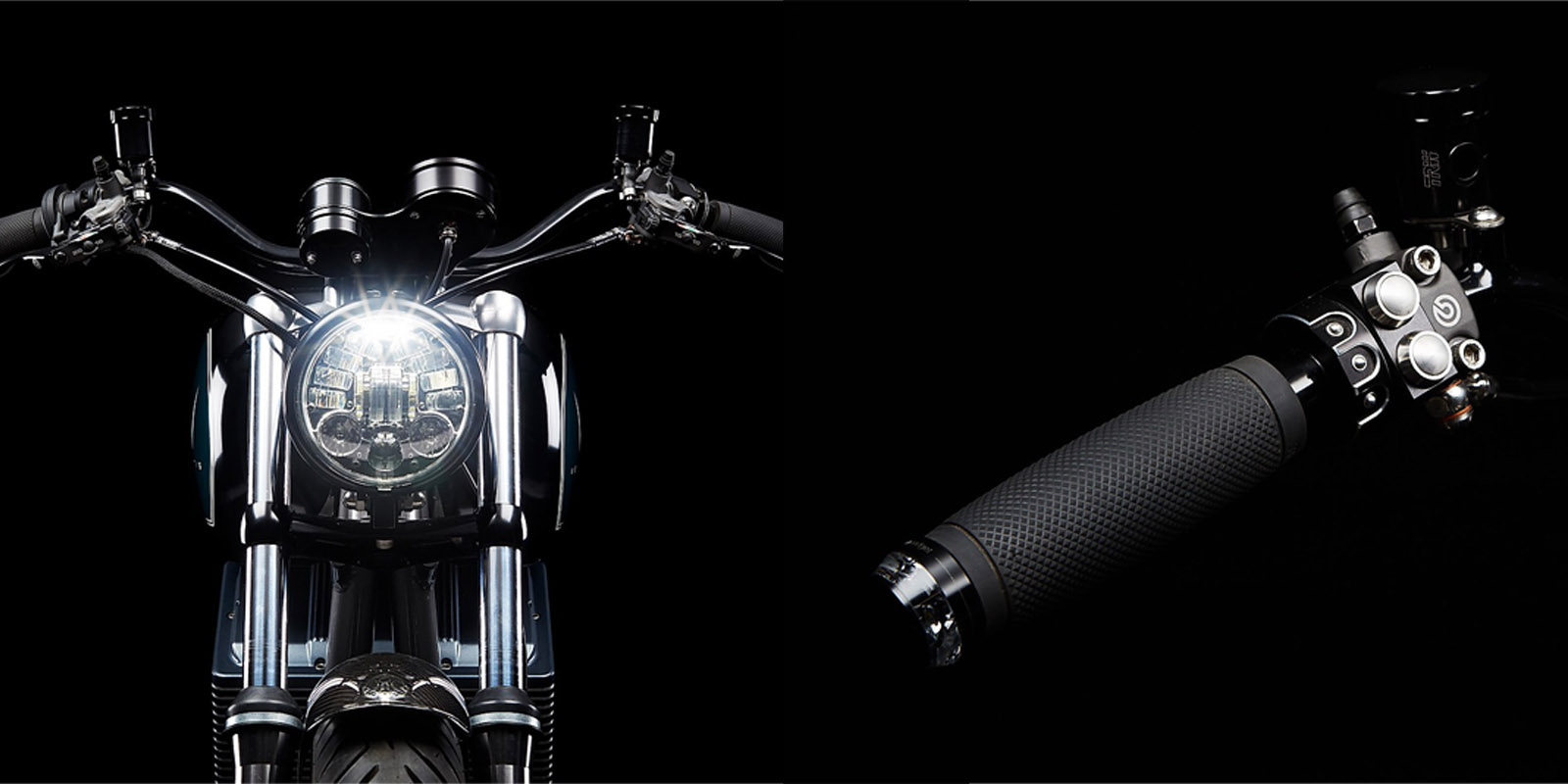
We knew the art direction was to be photography-led, so Steve commissioned a vehicle photography specialist. At the same time we began work writing the copy for the brochure and website.
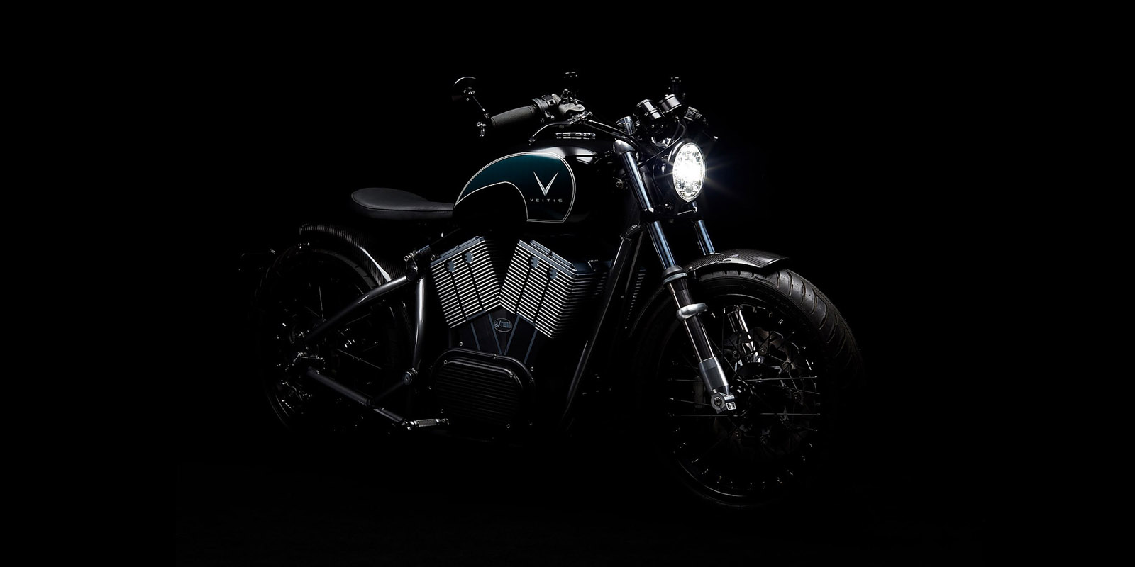
Brochure and website
To compliment the photography and branding, we chose the Montserrat as the primary typeface. We chose Montserrat as it is highly flexible, able to work well across large printed displays down to small mobile digital screens. It also draws on the same vintage values as the brand.
We designed the brochure and website with a magazine editorial feel. This allowed the striking product photography to breathe and take centre stage.
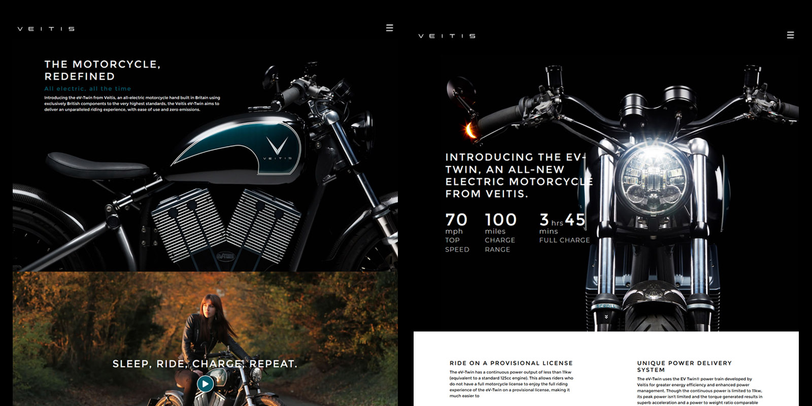
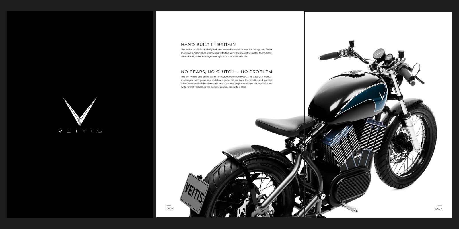
Mobile friendly exhibition
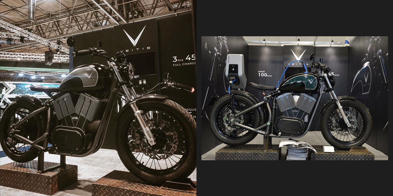
Exhibitions and events are a core part of the lives of motorbike enthusiasts. Steve himself was a regular attendee, and he aimed to be an active exhibitor at several events. We found a print company with a modular system that would be both portable and allow for different configurations of exhibition space.
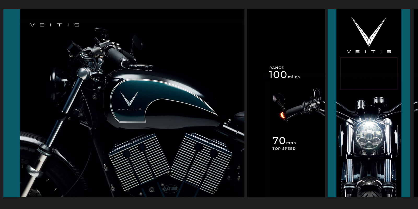
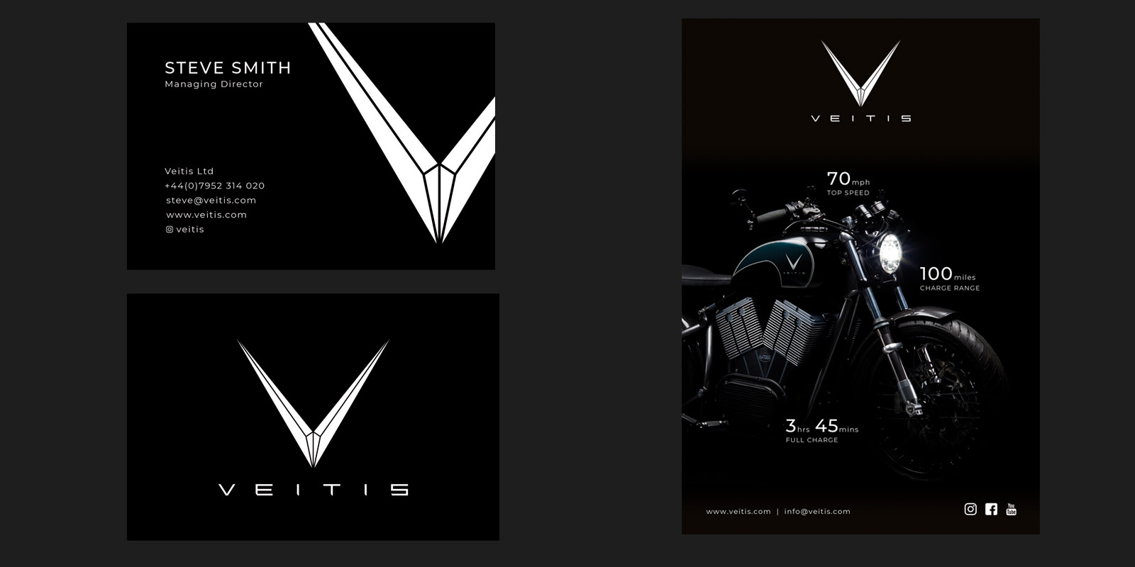
We also created some additional artwork for a business card and advert for the Motorcycle Live handbook.
Live-action production
Part of the brand is the idea that it harks back to the idea of driving being a pleasurable pursuit. To evoke such emotions we created a live-action teaser video shot on location in the Kent countryside.
We organised and directed a half-day shoot at Boughton Monchelsea Place hiring drone-camera specialists, a model and photographer. The result was a high-quality product teaser video and additional lifestyle photography content.
What we did
Branding
- Brand name development
- Logo design
- Modular exhibition stand design
- Brochure design
- Copywriting
- Business card design
- Handbook advert design
- Print management
Web design and development
- Visual design
- Mobile-friendly and responsive design
- Front-end development
- Content optimisation
- Hosting
Video and photography
- Live-action production
- Model hire
- Drone hire
- Post-production
- Lifestyle photography