Finding more applicants in a highly-competitive sector
This is a story about how we helped HATS Group meet their recruitment goals in a highly competitive sector.
Healthcare and Transport Services (HATS Group) provide transport services for SEN children to schools and non-emergency patients to hospitals.
HATS Group wanted to increase the number of applicants for their core roles in several areas across London, Essex and Kent. This sector is highly competitive. Although HATS Group was marketing vacancies, the number of applicants was low. The group website had a single recruitment page, but the content was out of date. The recruitment team also had difficulties getting anything changed.
HATS Group needed a solution to publish current vacancies and to advertise to a wider audience.
Blue House Design did exactly what they said they would. The team was very easy to work with; everything was clear and structured. And the end result improved our recruitment process.
- Client
- HATS Group
- Industry
- School and Special Needs Transport
- Patient Transport
- Services
- Web design and development
- Digital marketing
- Website
- HATS Group Recruitment
Results and impact
Increased applications by finding more people
Over 1,000 applications across all job roles in 2-months and reaching on average 16,000 people per month.
A flexible bespoke system that can be quickly improved
We delivered a bespoke system to react quickly to changing priorities, and make improvements based on real users.
Fully managed service
We handled all aspects of running the campaigns, so recruitment could focus on their day-to-day tasks.
Our bespoke solution
From our experience with recruitment in the patient transport sector, we proposed a solution that was comprised of two parts:
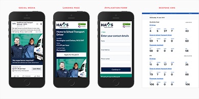
- advertise the jobs on social media
- design and develop a bespoke Content Management System (CMS) to create landing pages for each job and manage the applications
Social media advertising was intended to find more applicants and raise awareness of the roles on offer in a targeted way. In particular, Facebook adverts can be set up to be shown only to people in specific geographic regions.
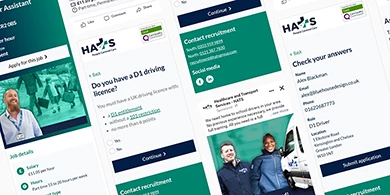
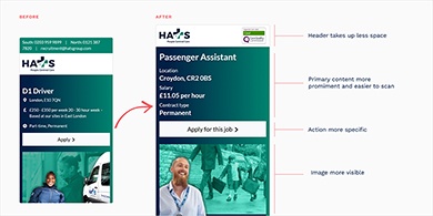
The bespoke CMS landing pages would provide a vital destination for the adverts, provide full job details and allow the user to quickly and easily apply for the role.
How do you design a system that meets business goals and is simple to use?
To make the system effective it was important we understood the recruitment process end-to-end, from a person seeing a job advert to being hired.
Our first step was to run a discovery workshop with the Director of Shared Services and the Head of Recruitment.
In the workshop, we used a technique known as the Question Protocol. The question protocol helps design forms that are easy to use. It works by reviewing each piece of information the form might capture with a series of questions such as:
- why you need it
- who needs it
- what they will do with it
- what actions are taken with it
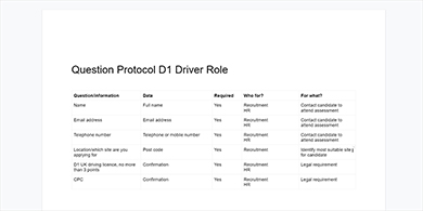
The technique is very good for weeding out unnecessary questions. Each question that remains then has a clear and specific purpose. This directly impacts how easy the form is for someone to complete. It also increases the accuracy of what someone enters, which in turn helps teams manage that information and make decisions.
How do you design forms that are easy to use?
Many job application forms are still designed where all the questions are shown on a single page:
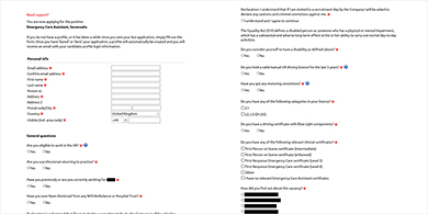
The assumption is that it's “just one page” and therefore “easier”. But research has shown it is anything but easy, and in fact routinely leads to inaccurate data.
A better approach is the one thing per page pattern. Here the form is split into a series of steps, each with a question about one thing.
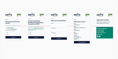
The one thing per page pattern also works very well with branching questions. A branching question has a different next step, depending on the answer that is submitted.
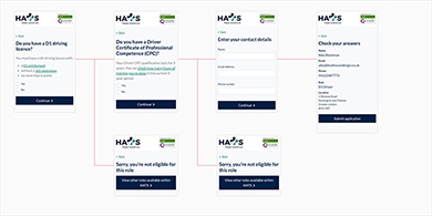
We came up with the idea of using branching questions to confirm the person has qualifications that some roles require. When they did not, we would direct them to a “sorry, you’re not eligible” page. This helps to ensure people who complete the application are eligible.
We also designed the “sorry, you’re not eligible” page with a link to other vacancies, so the person could find other roles.
Every word on the page matters
We knew several roles required the same pieces of information. But we also konw every role had at least one specific piece of information that was unique to that role.
It was clear that each role would need a bespoke application form. Using one template for all roles would not work.
This allowed us to dig into the details of how to make each question clear and easy to understand. We did research to make sure the words used are understood by the audience, and not organisational jargon.
Sometimes even a clearly written question can be ambiguous to answer. In these cases we wrote guidance content, so the user would have all the information they need to answer the question.
How do you meet goals that change?
From our initial conversations and the discovery workshop it was clear that priorities could change, quickly. The recruitment team was also being reorganised. So several things were changing at once.
To help the recruitment team transition, we agreed to develop the initial system with only a few vacancies.
The initial system also allowed us to validate what worked and identify areas to improve.
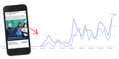
For example we were confident that most people would see mobiles. To test we setup Google Analytics and after a month we checked the data and found mobile use was a little over 92%:
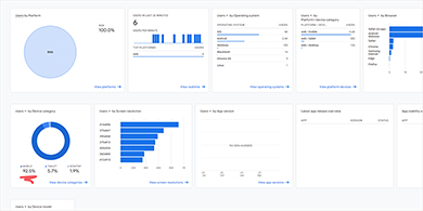
In the next round of development, we used this insight to further optimise the design of the website for mobile users.
Exploring other channels
When developing the bespoke CMS with more roles, we started to think if only using social media might be limiting the potential audience.
Not everyone uses social media and search engines still play a part in helping users find jobs near them.
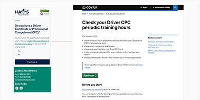
After some research we proposed to develop the landing pages with what’s called structured data. In Google search, a page with structured data can be displayed more prominently and in different ways to the regular blue links:
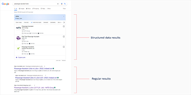
While our keyword research found the monthly search volume to be very low, we took an educated guess that these users might be a better fit. Specifically that they are actively looking for a certain role.
When we checked the data, we found that the bounce rate was 29% lower for users that came from Google. We also found the average session duration was some 2 minutes longer. Both these indicate more engagement and therefore the likelihood of someone applying.
What we did
Web design and development
- Discovery workshop
- Mobile-friendly and responsive design
- Interaction design
- Front-end development
- Bespoke Content Management System
- Structured data for Google Search Jobs
- Content design and copywriting
- User research
- Hosting
Digital marketing
- Facebook advert design and copywriting
- Campaign setup and budget controls
- Remarketing
- Campaign management
- On-page SEO
- Monthly performance reports
- Keyword research
- Google Analytics setup