Designing an WCAG 2.1 level AA accessible website
This is a story about how we refreshed a dated website while meeting accessibility obligations.
The Kent Public Services Network (KPSN) is responsible for several high-performance networks across Kent and Medway. This includes critical networks used by emergency services, schools and local authorities.
KPSN is self-funded and responsible for sustaining its future. KPSN was looking to grow the organisation and attract more partnerships.
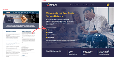
But the website was “outdated” and had an “ancient Content Management System”. They had already commissioned a new visual identity, then looked for an agency to overhaul the website.
Accessibility was a critical requirement. Since 2018, public sector organisations are legally responsible for their websites to meet accessibility standards. The “outdated” website was developed using WordPress and had failed an accessibility audit.
Our solution was to design a bespoke Content Management System and address accessibility right from the start.
We would like to thank Blue House for working with us on all aspects of creating our new website and for their ongoing support.
We were looking for a total website refresh but wanted to retain our sense of identity while making the website easy to use. Blue House helped us design a site that is easy to navigate, clear, and concise for our users.
We also wanted a content management system which would give us the flexibility to update content ourselves; without the need to raise calls or job tickets.
Blue House Design presented us with different options, and we were able to agree on the design our new site would take. They also helped us to meet all the requirements of a demanding accessibility audit.
- Client
- Kent Public Service Network (KPSN)
- Industry
- Regional Public Service Network
- Technology and ICT
- Local Government
- Services
- Web design and development
- Website
- KPSN
Results and impact
WCAG 2.1 level AA compliant website
The website passed the accessibility audit first time round with only a few very minor issues to resolve.
Bespoke Content Management System (CMS)
Tailored to the needs of their content, without all the usual bloat of an off-the-shelf CMS.
Aligning several teams
We kept everyone aligned throughout the project, so everyone felt part of the final outcome.
The full story
Start with discovery
We started by gathering information about the current website. Content, performance metrics, user data and any branding collateral we could find.
The website audit revealed several issues.
Many pages were duplicated. Several web pages were grouped under “portfolio” despite being about other topics.
We also uncovered “hidden” pages that could only be found via search, or in-page links. In short, content was poorly organised and difficult to navigate.
How do you design an accessible website?
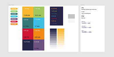
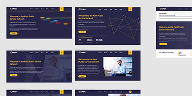
The new visual identity was designed with a broad colour palette that KPSN were keen to use. Colour contrast is core to accessibility, so one of our first tasks was to assess the colour palette.
This would help us decide on colour combinations that would be accessible and influence the design overall.
KPSN were responsible for revising the website content. While they had an initial plan, it was very much still in flux. We knew early on that we needed to design pages as a whole, so both parties could assess the visual design and content together.
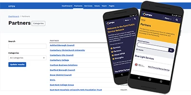
To keep things manageable we narrowed in on the core content: services, partners, about, and news.
How do you keep the whole team in the loop?
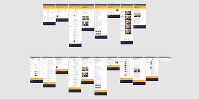
In our workshops we transformed the mockups into a clickable prototype. This allowed KPSN to assess the design as closely as possible to a real website.
KPSN found this tool especially useful as it enabled them to share the designs internally. All team members had the opportunity to see progress and provide feedback.
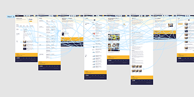
Some aspects of a design come together quickly. But others needed more time to create the right solution.
The home page was one such example. We explored several options – including ones we thought may not work – so KPSN could make a clear and informed choice.
How do you develop an accessible website?
By designing core pages as a whole and using it to help define content, we were able to spot where components could be reused. When developing this meant we could develop a feature and limit the number of variations.
This left time for us to delve into more thorny challenges such as the menu bar. Menu bars are critical for users browsing a website. They are also one of the most complex components as they often feature various interactive controls.
During the design phase we spent additional time exploring options with the team.
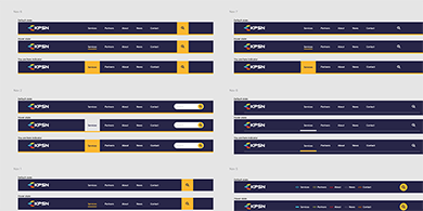
The main challenge developing accessible menu bars is the variety of contexts it needs to work under. For example a menu bar has to work:
- On any sized device
- When CSS is disabled
- When JavaScript is disabled
- When CSS and JavaScript is disabled
- 400% zoom
- Keyboard use only
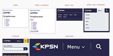
One common issue we resolved is that menu bars often have buttons that show and hide content: for example a menu.
These typically work by changing the CSS on the content that is shown/hidden when the user interacts with the button. But when CSS is disabled the button appears to have no functionality, as the content is already visible. This will fail an accessibility audit.
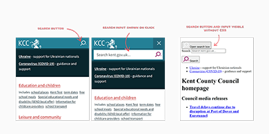
We explored and tested several techniques, in particular checking browser support, before settling on using an HTML attribute “hidden”. The attribute has the same effect as using CSS, but crucially because it is HTML will function when CSS is disabled.
How do you pass an accessibility audit first time?
From our initial conversations with KPSN, we knew the accessibility audit would be conducted by Kent County Council’s Digital Accessibility Team.
We made sure the team was included during the project, so we could make full use of their guidance. Accessibility is tough partly because the Web Content Accessibility Guidelines (WCAG) is not a checklist. Some criteria have an amount of interpretation whereas other criteria do not.
During development we also created a “beta website”, so that when we needed clarification on technical aspects of WCAG 2.1 there was a real working example to look at. This made it easier to align all parties and have focused conversations about critical design elements.
Doing so helped ensure when the live website was audited, there were only a handful of very-minor issues found. This saved considerable time as only minor amendments of the code were needed and not entire refactors.
What we did
Web design and development
- Discovery and website audits
- Design research
- Full-page mockups and interactive prototypes
- Mobile-friendly and responsive design
- Favicon design
- WCAG 2.1 level AA accessible front-end development
- Bespoke Content Management System development
- Beta website
- Accessibility testing
- 3rd party cookie consent setup
- Setup Google Analytics
- Hosting