Creating a customer focused ecommerce experience
This is a story of how we redesigned an established ecommerce store to fix problems and stay ahead of the competition.
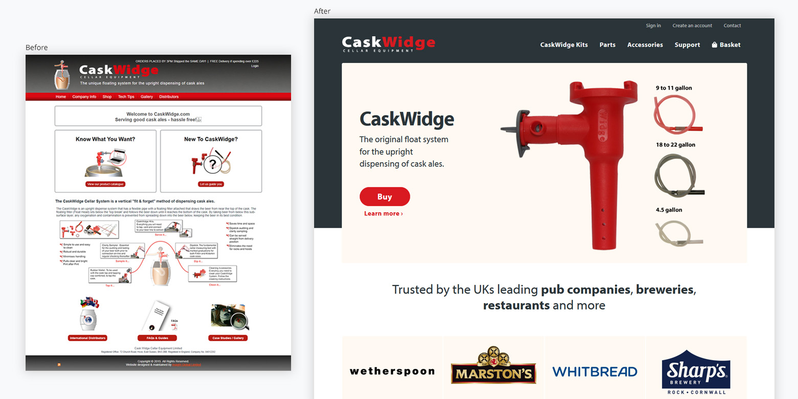
CaskWidge is the original manufacturer of the caskwidge, a device to dispense ale from an upright barrel. While a leader in the market, they were embarrassed by their 16 year old ecommerce website. It did not work on a mobile, and they knew parts of the website were frustrating for customers.
Blue House Design was given three tasks:
- Uncover problems faced by customers and CaskWidge with the current system
- Redesign the front-end to resolve these issues
- Replace the back-end with a custom-built bespoke system
- Client
- CaskWidge
- Industry
- Online Retail
- Manufacturing
- Services
- Web design and development
- Website
- CaskWidge
Results and impact
Simpler customer journey
with easy to find products and checkout.
Removed a major bottleneck
76% of customers now use guest checkout.
New sales channel
33% of sales from mobile devices.
Reduced errors
by integrating postcode lookup service into the checkout process.
The full story
Strategy and research
We conducted a discovery project to understand the problems that faced by customers and CaskWidge. This importd activities such as stakeholder interviews, workshops, competitor analysis and customer research.
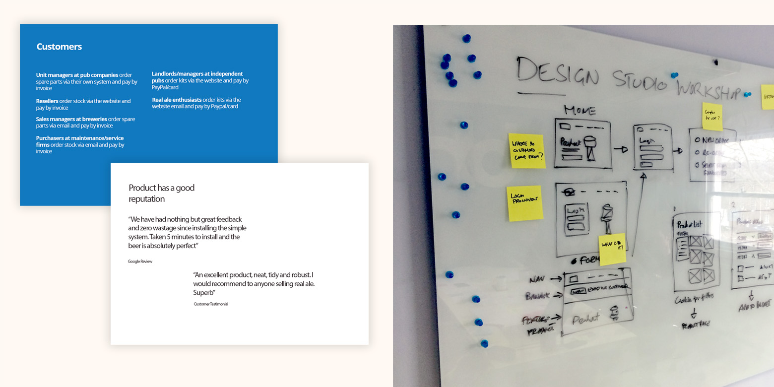
We audited the current website to gather information about the content, structure and performance. What are the main navigation options? Is it mobile friendly? What are the product categories? Is the website fast?
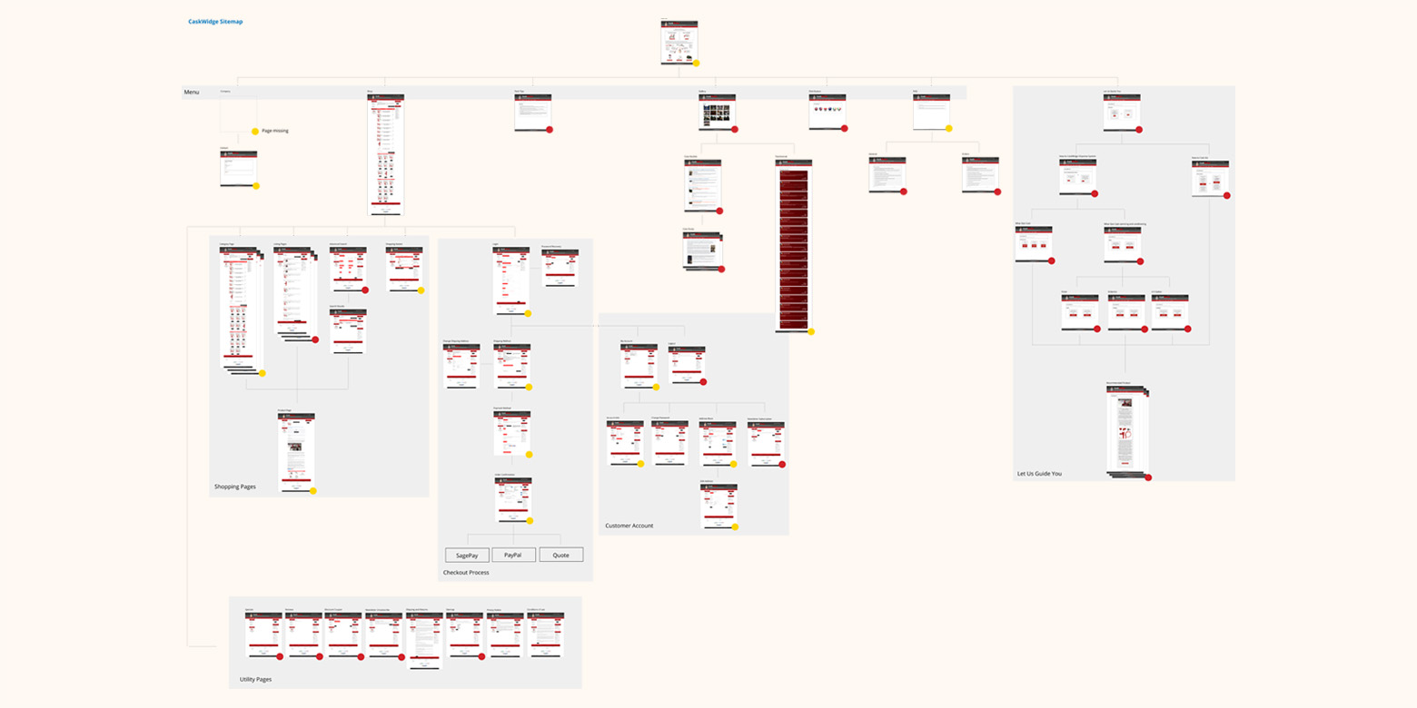
The project was thorough mapping and reviewing processes end to end. We used and reviewed each feature of the website, creating test orders and customer accounts.
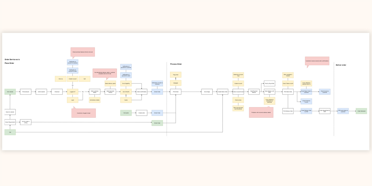
At the end of the discovery phase we created a roadmap – a list of ideas – to determine what to develop now, and what to develop in the future. This enabled us to use the project budget to focus on developing core features that had the most impact.
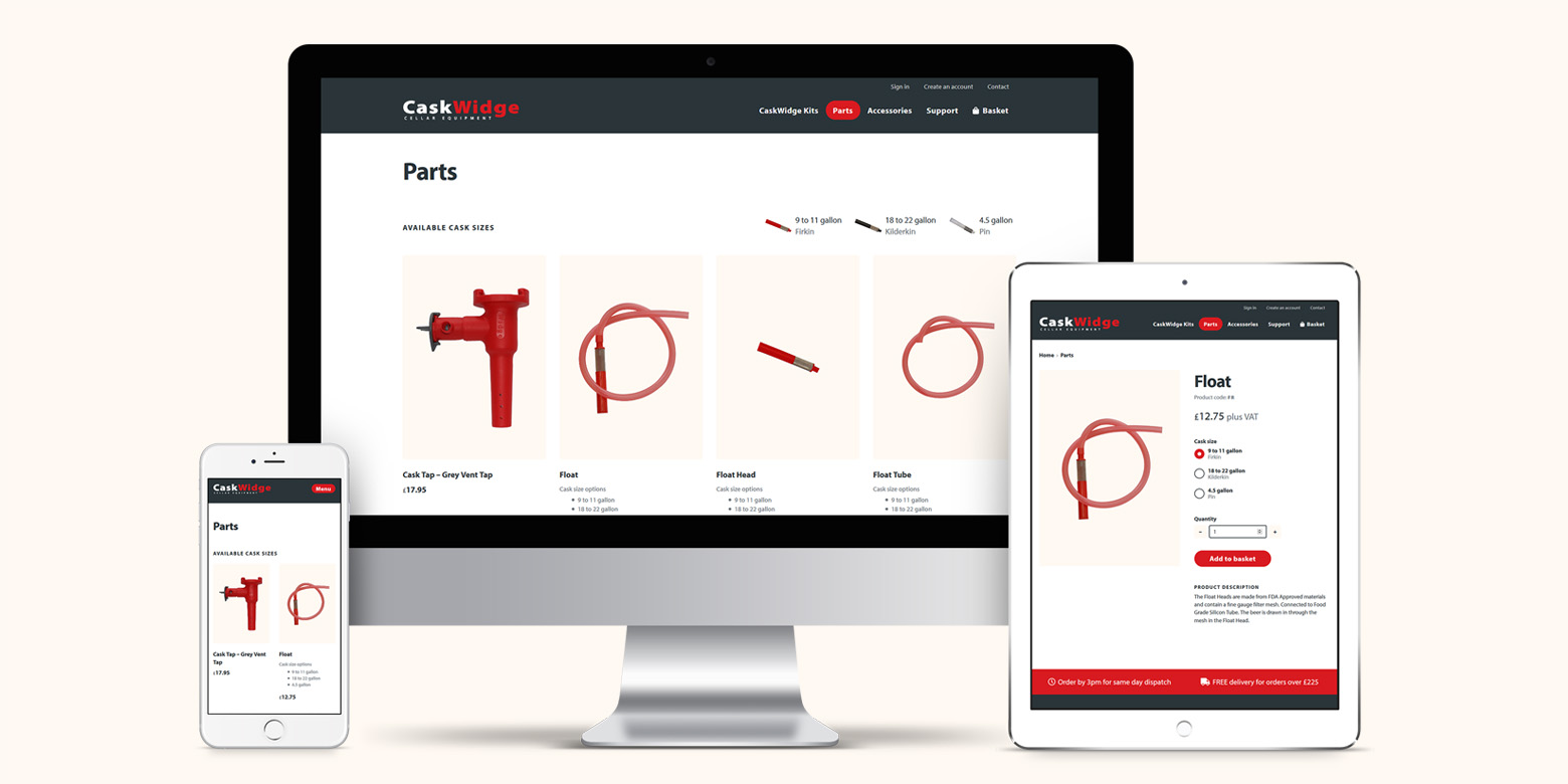
Making products easy to find
The core of any ecommerce system are the products and how they are organised. From our research, we realised the design of the listing pages was particularly complex and confusing to customers.
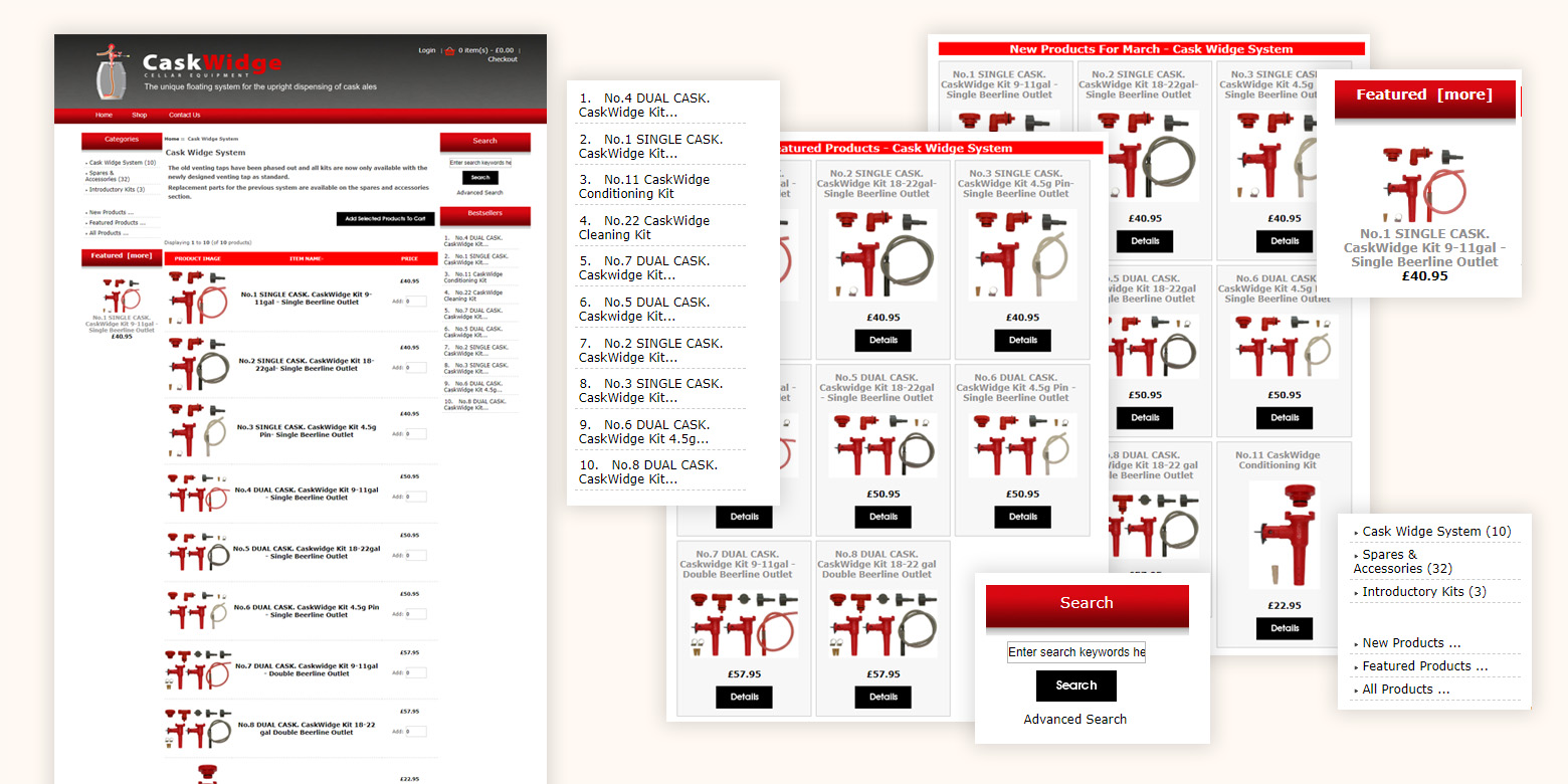
We realised many product options were for the same item. For example, the Float is available in three sizes, so there were three products, one for each size.
A problem with this is that it puts cognitive strain on customers. To determine the specific version of a product they need requires significant effort to review and compare several items. A common outcome being the customer orders the wrong item. This in turn leads to a frustrating experience and additional admin for the business.
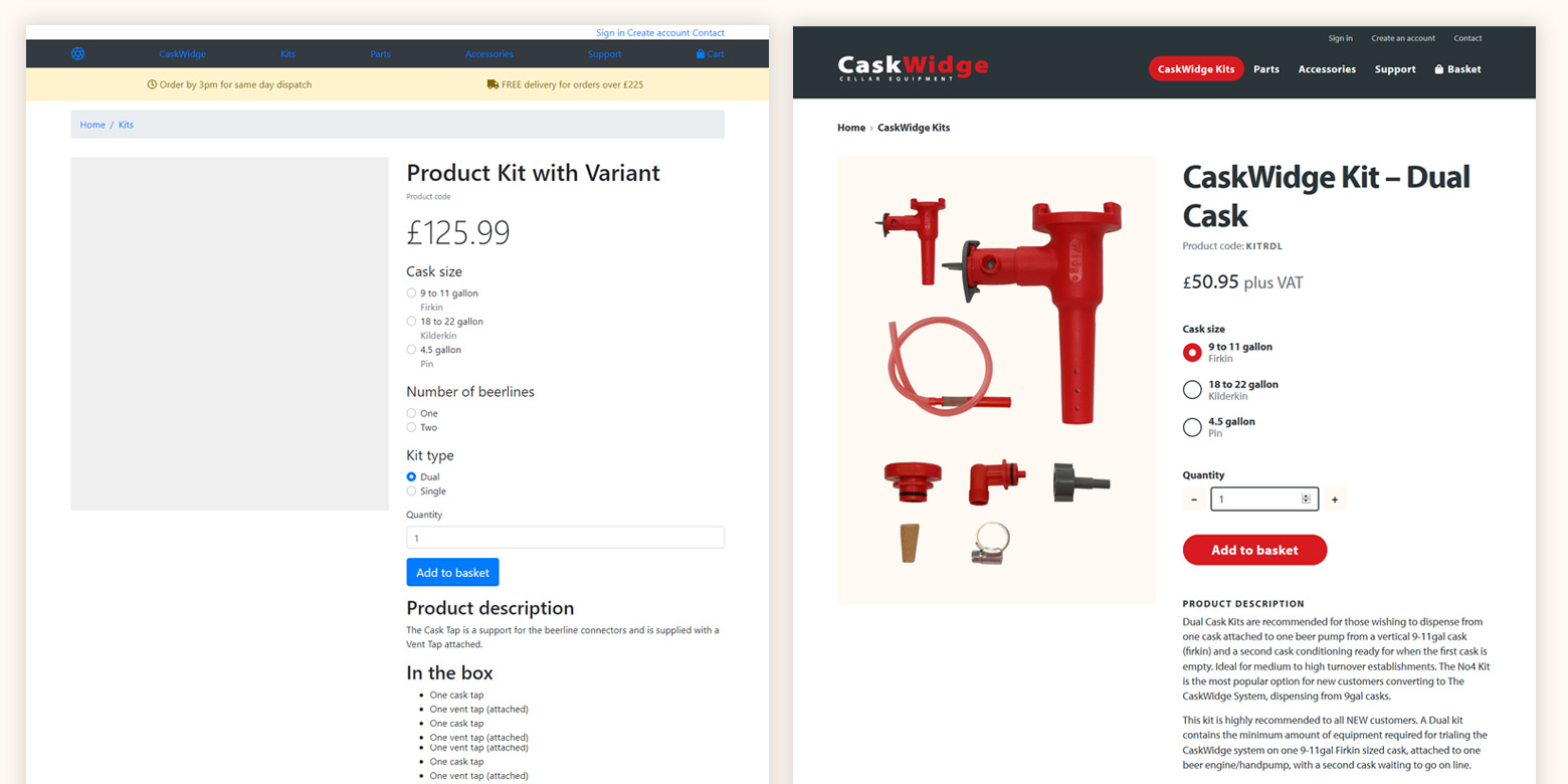
We came up with a concept for a “product variants” feature where items would be consolidated into a single product. The customer would choose the right version using controls on the product page.
We created a code prototype in HTML and CSS, so we could share our thinking and review with CaskWidge before committing to development.
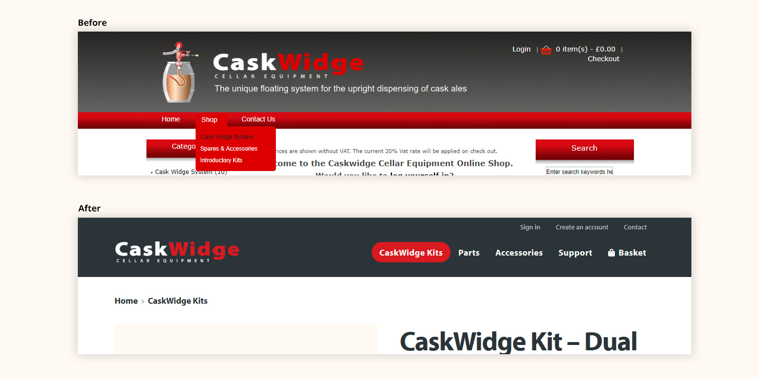
Improving the navigation
As well as changing the design of the product listing and product pages, we also revised the navigation to make products easier to find. The original website grouped three listing pages under a “Shop” drop down menu:
- CaskWidge System
- Spares & Accessories
- Introductory Kits
We analysed the research we had gathered during the discovery project, looking at the sales volume for each category over the past 16 years.
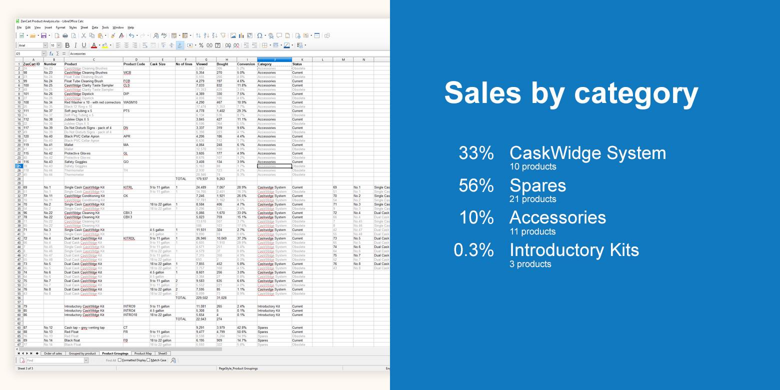
The data showed that at 0.3% of sales “Introductory Kits” did not merit its own category. It was also clear that “Spares & Accessories” should be split into separate listing pages.
As well as revise the menu options, we made the links top-level items. Customers could then immediately see the options without having to interact with a drop down menu.
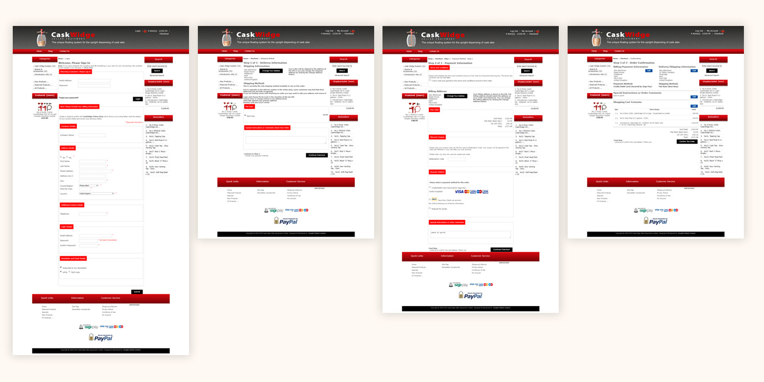
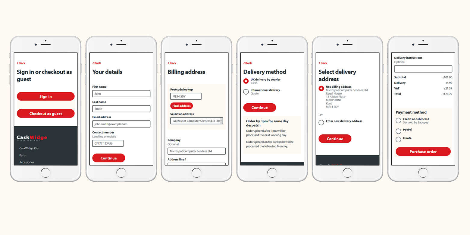
Designing a better checkout experience
From our research we found the checkout experience a significant cause of frustration. CaskWidge assumed the problem was that the password reset did not work. From our research we found the real reason was a combination of two things:
- To place an order you had to have an account
- The account password had to be changed every 3 months
Both act as barriers, but changing the password in particular was the trigger for support calls. The design of the sign in page also did not help. It was incredibly cluttered and combined several tasks:
- sign in
- entering contact details
- entering a billing address
- creating an account/password
- subscribing to a newsletter
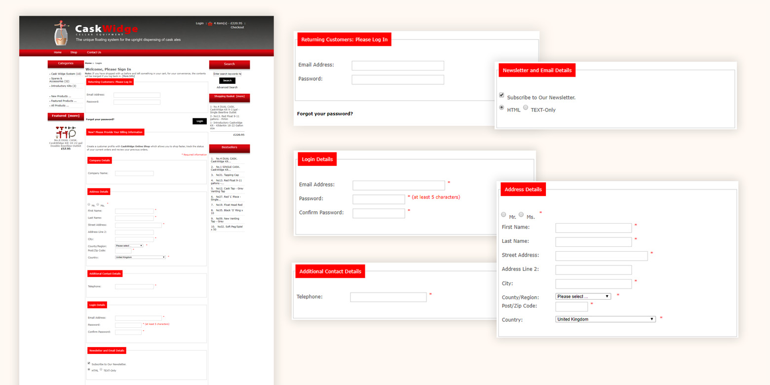
The key solution to these problems was to adopt a one thing per page pattern. This means separating the tasks into their own dedicated pages. This allows the customer to focus on the task in hand and dramatically reduces errors.
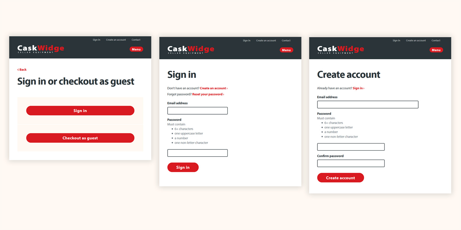
We applied this design pattern throughout the website and the checkout in particular. The pattern is also known to be better for mobile users where screen size is at a premium.
What we did
Strategy
- Discovery and design research
- Competitor analysis
- Market research
- Stakeholder interviews
- Planning and requirements
- Service mapping
- Website audit
- Content audit
Web design and development
- Visual design
- Mobile-friendly and responsive design
- Interaction design
- HTML and CSS prototypes
- Custom-built ecommerce app
- 3rd party service integration
- Database migration
- Google Analytics setup
- FullStory setup
- Hosting